Appearance
FluentCart Product Widgets for Elementor
The FluentCart Product category in the Elementor editor groups 10 focused widgets built for Elementor Pro Theme Builder. Use them inside single-product templates, archive templates, or theme parts — they automatically read the current product's data, so the same template works across your entire catalog.
INFO
Theme Builder widgets work best when Source is set to Current Product inside a Theme Builder template. Setting Source to Custom lets you preview a specific product while editing the template.
Before you can use these widgets, make sure the Elementor Blocks addon is turned on. See Using Elementor Widgets for the activation steps.
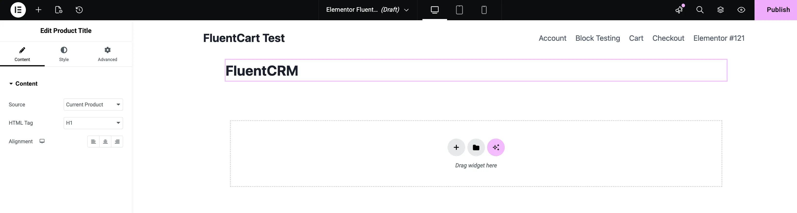
1. Product Title
Renders the title of the current product. Use it as the H1 on your single-product template.
- Content Tab: Configure the source and tag.
- Source: Pull from the Current Product or a Custom product.
- HTML Tag: Pick the tag — typically H1 for single-product pages, or H2 / H3 when used inside cards or summary blocks.
- Alignment: Align the title left, center, right, or justified.
- Style Tab: Customize typography, color, and text shadow.
- Advanced Tab: Standard Elementor controls.
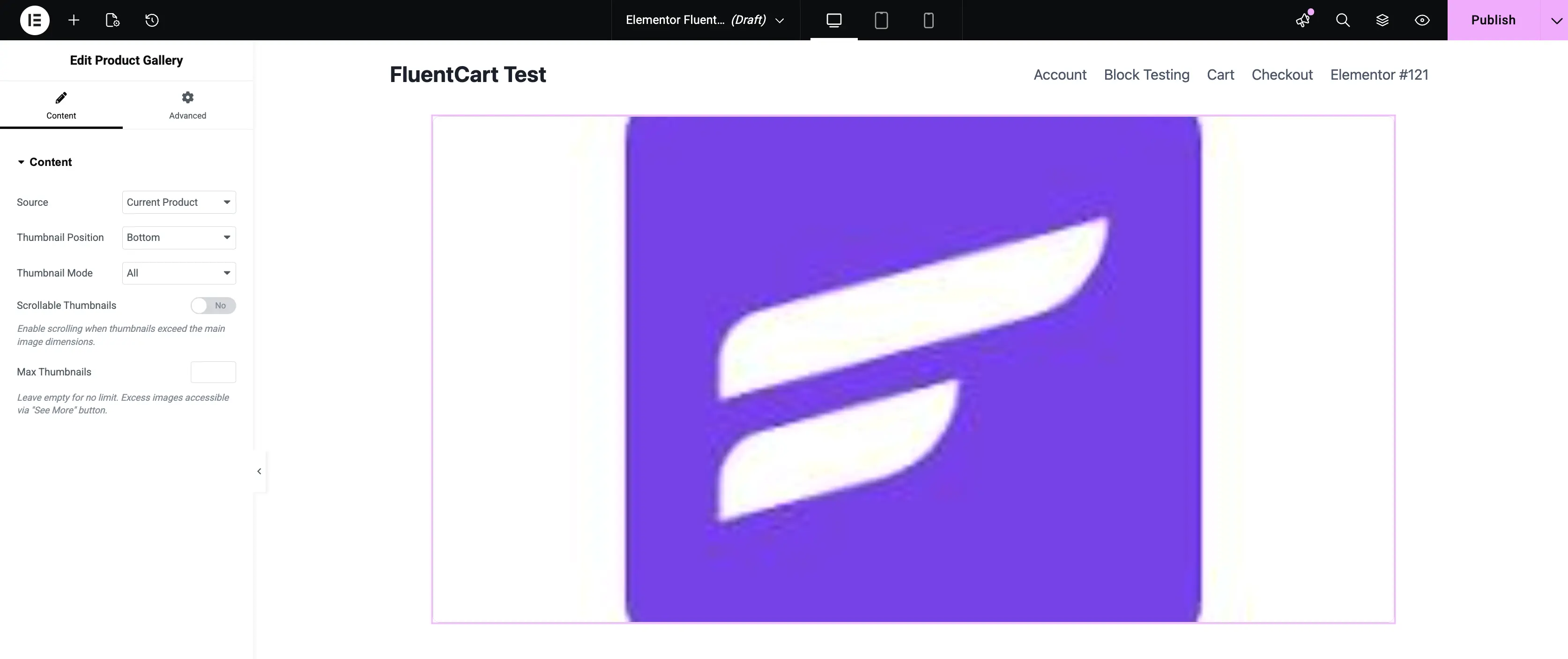
2. Product Gallery
Renders the product's image gallery with the main image plus thumbnails. Use it on single-product templates to put the gallery exactly where you want it.
- Content Tab: Configure the gallery layout.
- Source: Pull from the Current Product or a Custom product.
- Thumbnail Position: Place the thumbnail strip at the Bottom, Top, Left, or Right of the main image.
- Thumbnail Mode: Show All thumbnails or limit them with Max Thumbnails.
- Scrollable Thumbnails: Turn this on to enable scrolling when the thumbnails exceed the gallery's dimensions.
- Max Thumbnails: Cap the visible thumbnails — extra images become accessible behind a See More button.
- Advanced Tab: Standard Elementor controls.
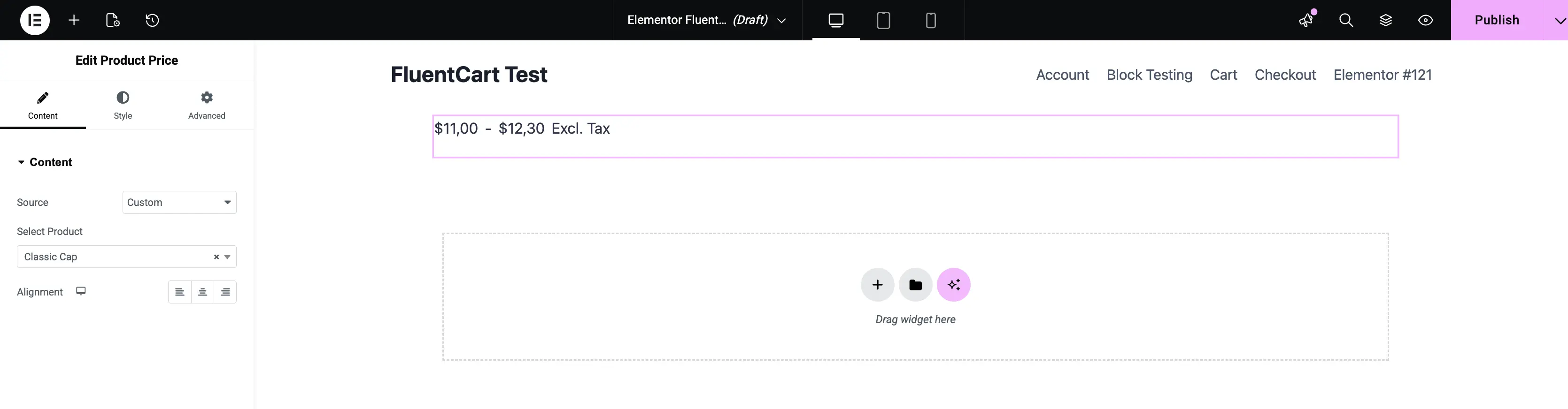
3. Product Price
Displays the current product's price. For variable products, it shows the price range — and updates automatically when a customer picks a variation.
- Content Tab: Configure the price source.
- Source: Pull from the Current Product or a Custom product.
- Select Product: When Source is Custom, pick the product whose price you want to display.
- Alignment: Align the price left, center, or right.
- Style Tab: Customize typography, regular-price color, sale-price color, and spacing.
- Advanced Tab: Standard Elementor controls.
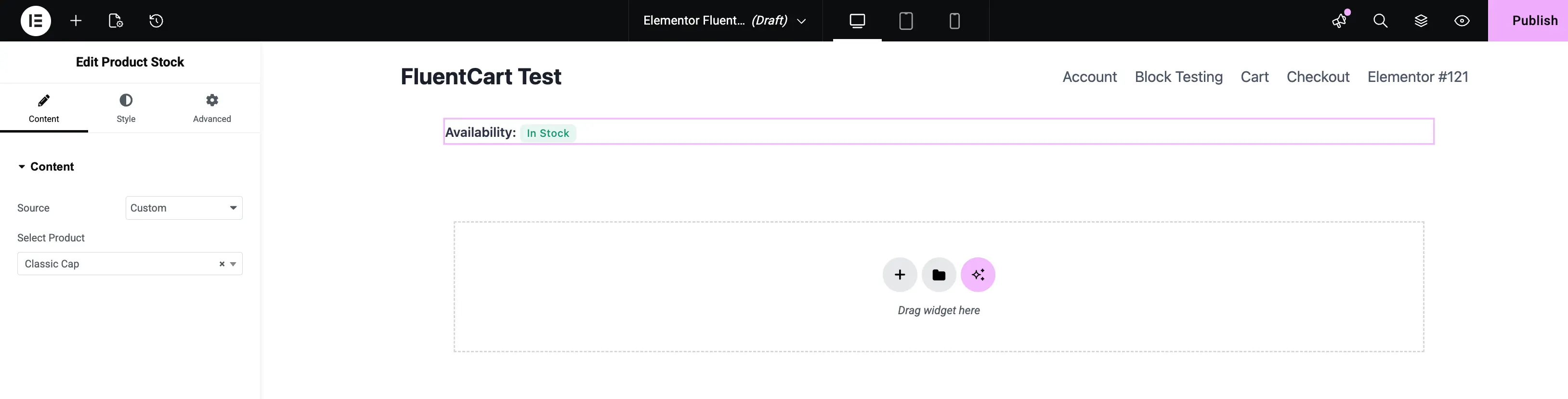
4. Product Stock
Shows the current product's stock status — In Stock, Out of Stock, or a custom availability label.
- Content Tab: Configure the source.
- Source: Pull from the Current Product or a Custom product.
- Select Product: When Source is Custom, pick the product to display.
- Style Tab: Customize the label typography and the color used for each stock state.
- Advanced Tab: Standard Elementor controls.
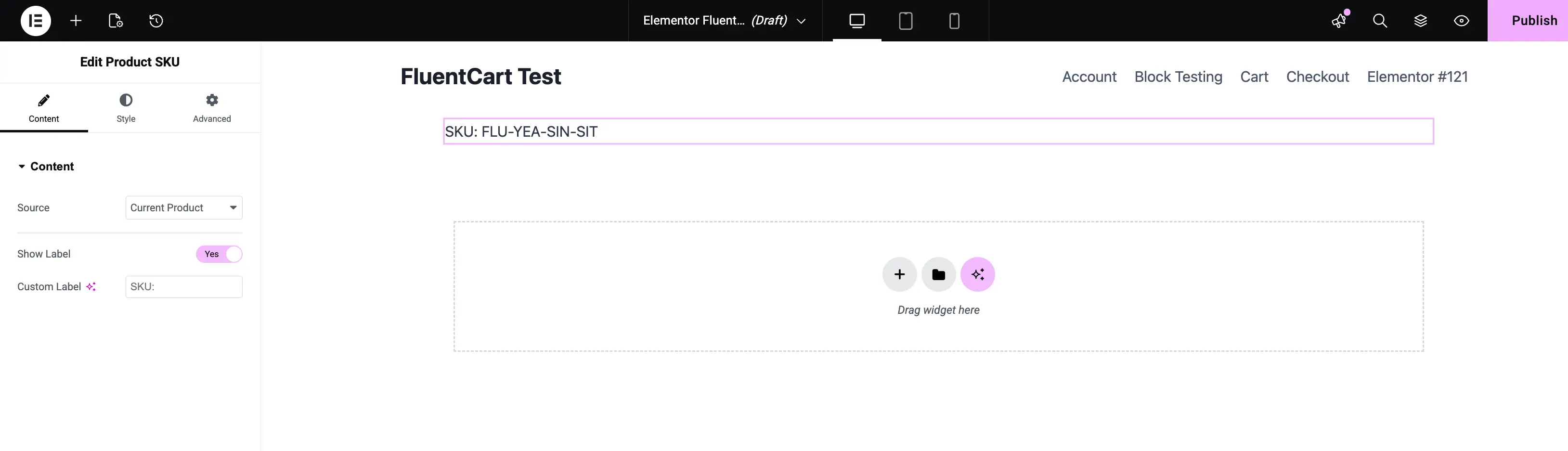
5. Product SKU
Displays the SKU (Stock Keeping Unit) of the current product. For variable products, the SKU updates when a customer selects a variation.
- Content Tab: Configure the label and source.
- Source: Pull from the Current Product or a Custom product.
- Show Label: Turn this on to prepend a label before the SKU value.
- Custom Label: Set the literal label string (default is
SKU:).
- Style Tab: Customize label typography, value typography, and color — independently.
- Advanced Tab: Standard Elementor controls.
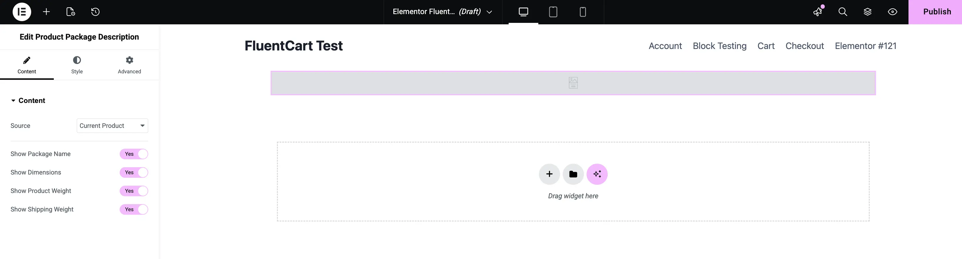
6. Product Package Description
Surfaces the product's package metadata — package name, dimensions, product weight, and shipping weight — in a clean table on the template.
- Content Tab: Choose which rows to show.
- Source: Pull from the Current Product or a Custom product.
- Show Package Name: Toggle the package-label row.
- Show Dimensions: Toggle the
L × W × Hrow. - Show Product Weight: Toggle the product's own weight row.
- Show Shipping Weight: Toggle the combined product + package weight row.
- Style Tab: Customize row spacing, label typography, value typography, and divider colors.
- Advanced Tab: Standard Elementor controls.
The data comes from the package assigned in the product's Pricing & Shipping settings.
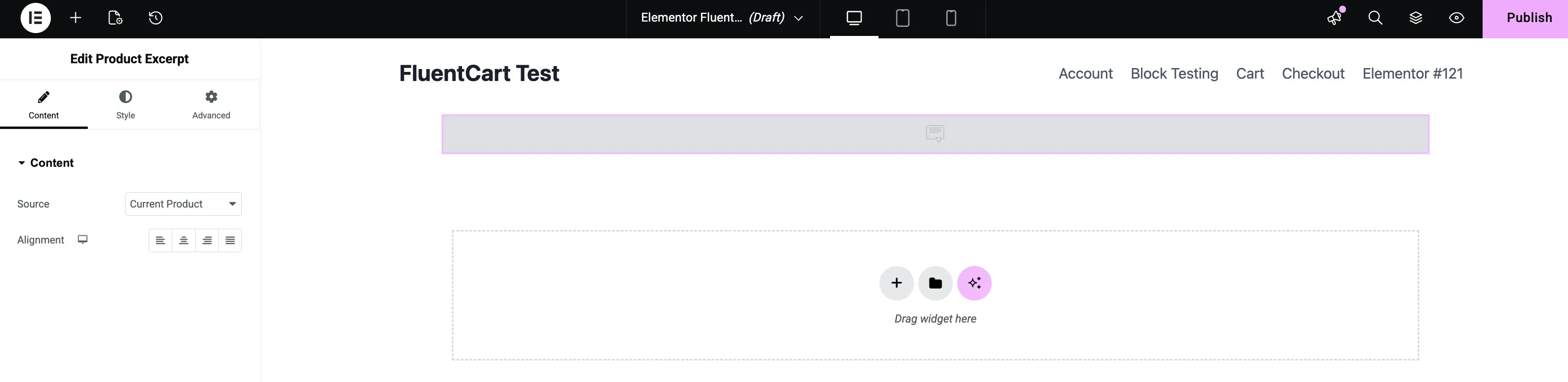
7. Product Excerpt
Renders the product's short description (excerpt). Use it on single-product templates above the buy section, or on archive templates as a quick teaser.
- Content Tab: Configure the source.
- Source: Pull from the Current Product or a Custom product.
- Alignment: Align the excerpt left, center, right, or justified.
- Style Tab: Customize typography, color, and spacing.
- Advanced Tab: Standard Elementor controls.
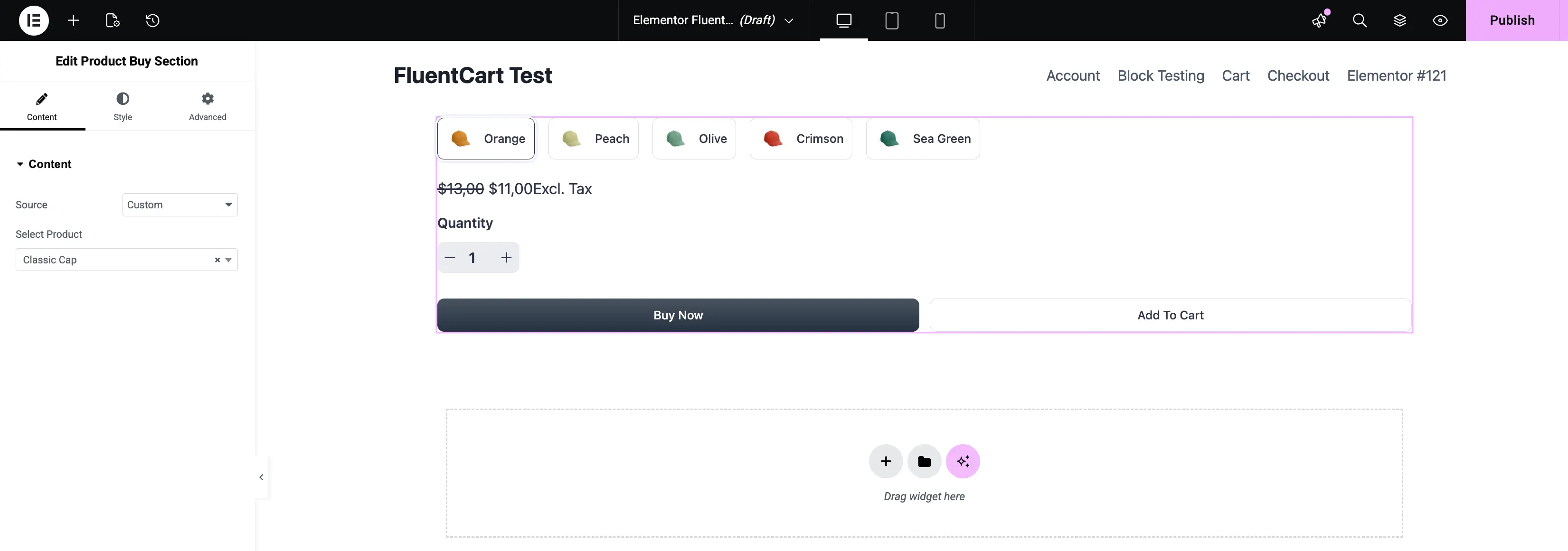
8. Product Buy Section
The full purchase block — variation selector, price, quantity field, Buy Now button, and Add to Cart button — rendered as a single widget. Drop it onto your single-product template to give customers everything they need to check out.
- Content Tab: Configure the source.
- Source: Pull from the Current Product or a Custom product.
- Select Product: When Source is Custom, pick the product to preview.
- Style Tab: Customize the variation chips, price display, quantity input, and both action buttons — each has its own typography, color, and spacing controls.
- Advanced Tab: Standard Elementor controls.
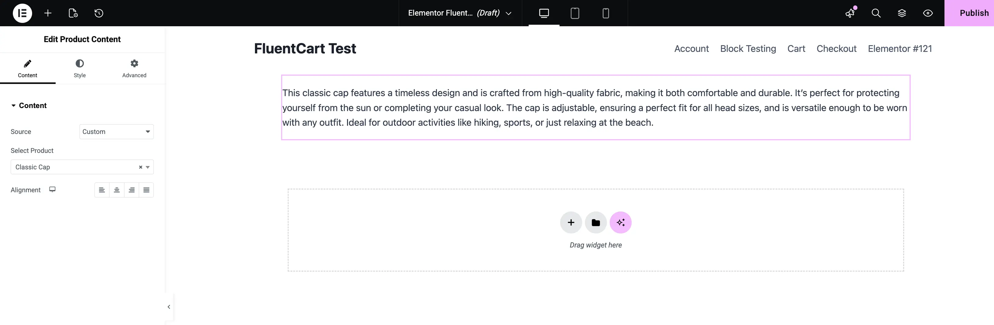
9. Product Content
Renders the long-form product content — the rich-text body of the product. Use it on single-product templates to place the full description anywhere you want, instead of relying on the theme's default placement.
- Content Tab: Configure the source.
- Source: Pull from the Current Product or a Custom product.
- Select Product: When Source is Custom, pick the product to preview.
- Alignment: Align the content block left, center, right, or justified.
- Style Tab: Customize typography, link colors, and spacing.
- Advanced Tab: Standard Elementor controls.
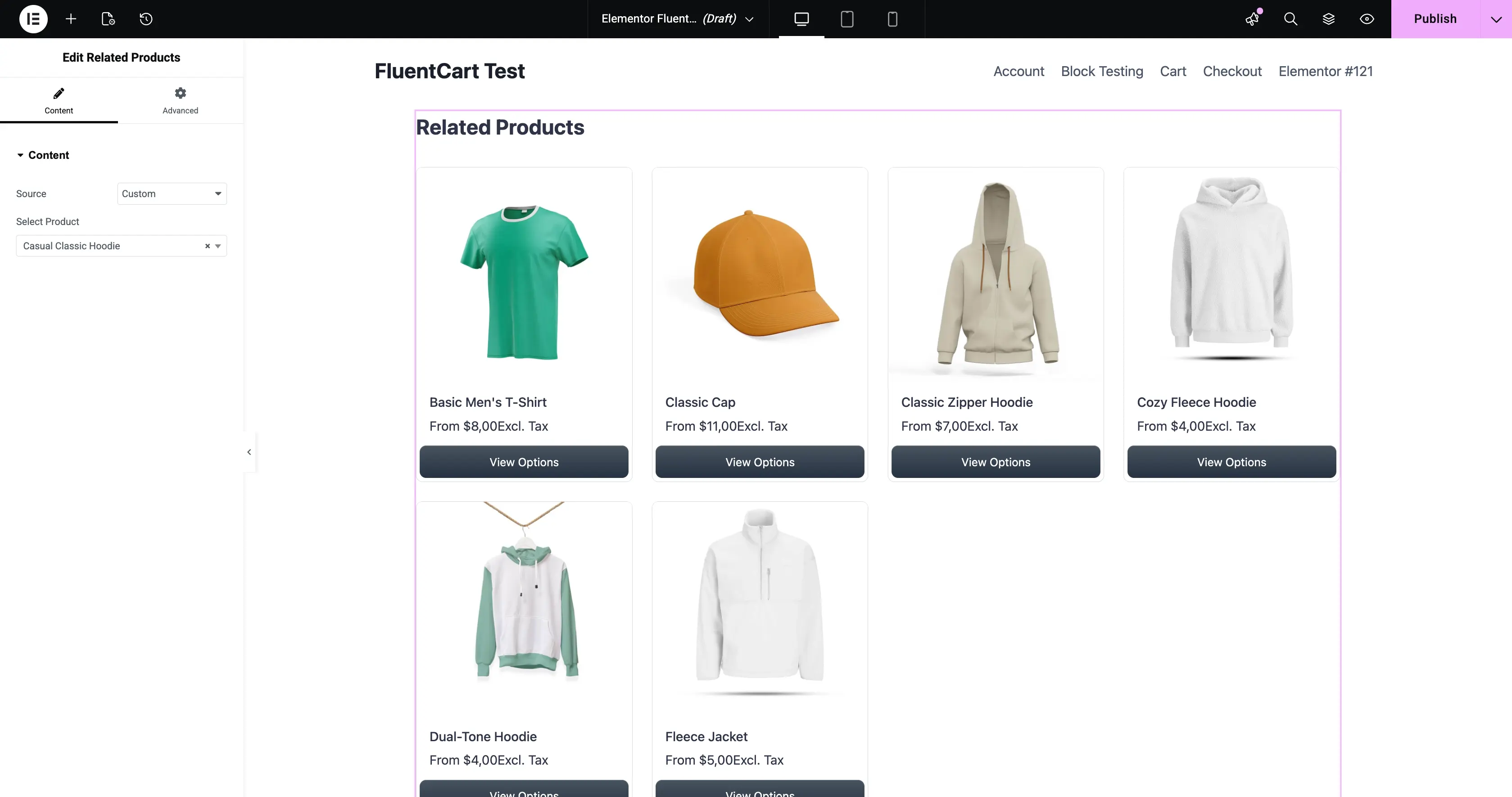
10. Related Products
Renders a row of products related to the current product. FluentCart picks the related items based on shared categories and tags, plus any manual relations you set in the product editor.
- Content Tab: Configure the query.
- Source: Pull from the Current Product or a Custom product.
- Select Product: When Source is Custom, pick the product whose related items you want to preview.
- Style Tab: Customize the card spacing, typography, button styles, and image aspect ratio.
- Advanced Tab: Standard Elementor controls.
What's Next
Looking for the store-wide widgets (cart, checkout, search bar, store logo, etc.)? Head to FluentCart Widgets for Elementor.