Appearance
FluentCart Widgets for Elementor
The FluentCart category in the Elementor editor groups 12 store-wide widgets you can drop on any page — your home page, shop page, header, footer, or a custom landing page. They cover product display, cart, checkout, navigation, branding, and the all-in-one Product Info summary.
INFO
Before you can use these widgets, make sure the Elementor Blocks addon is turned on. See Using Elementor Widgets for the activation steps.
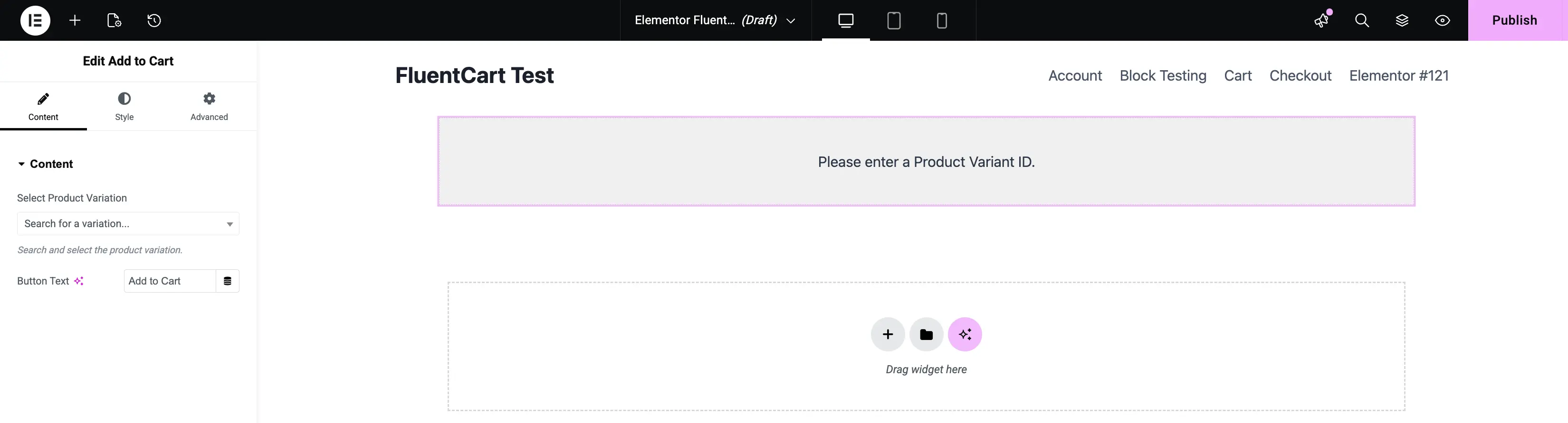
1. Add to Cart
Adds a single Add to Cart button that customers can click to drop a specific product (or variation) into their cart without leaving the page.
- Content Tab: Pick what the button sells and how it reads.
- Select Product Variation: Search for and select the product or variation this button should add.
- Button Text: Customize the button label (default is Add to Cart).
- Style Tab: Customize the button's typography, background color, text color, border, hover state, and padding.
- Advanced Tab: Standard Elementor controls for margin, padding, and responsive visibility.
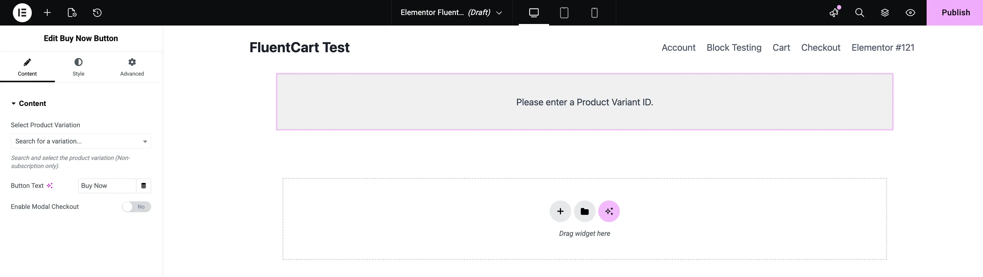
2. Buy Now Button
A focused shortcut that sends customers straight to checkout without stopping at the cart. Perfect for landing pages built around a single offer.
- Content Tab: Set up what the button sells and how it behaves.
- Select Product Variation: Choose the product or variation this button represents.
- Button Text: Set the custom button label (default is Buy Now).
- Enable Modal Checkout: Turn this On to open the checkout in a popup over the same page. Leave it Off to redirect customers to your normal checkout page.
- Style Tab: Style the background color, text color, typography, borders, and hover effects.
- Advanced Tab: Standard Elementor positioning and responsive controls.
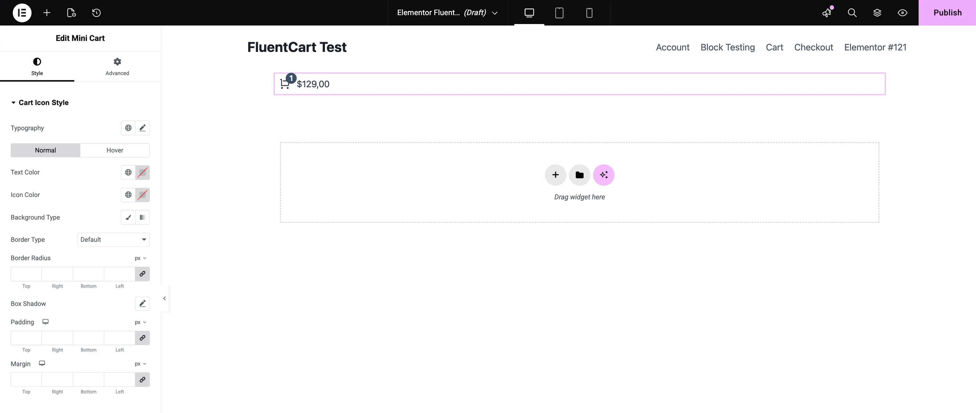
3. Mini Cart
A compact cart icon that usually sits in your site header. It lets customers see their cart count and total without leaving the current page.
- Style Tab: Almost all customization lives in Cart Icon Style.
- States: Style Normal and Hover states separately.
- Typography & Colors: Adjust the typography, text color, and icon color.
- Container Style: Pick a Background Type (Classic or Gradient), choose a Border Type, set the Border Radius for rounded corners, and add a Box Shadow.
- Advanced Tab: Fine-tune padding and margin so the cart icon aligns perfectly with the rest of your header.
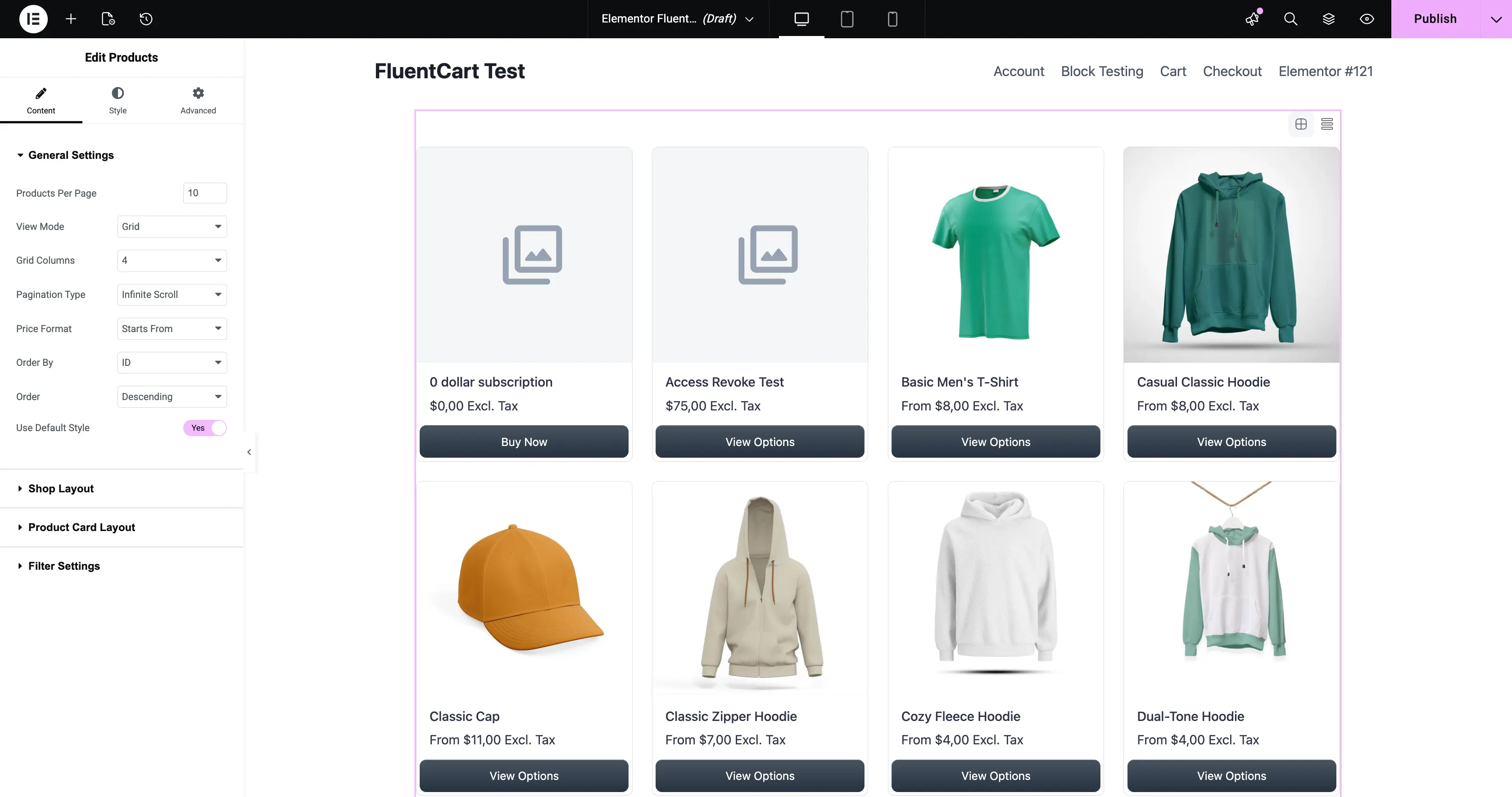
4. Products
The main widget for building shop pages. It renders your product catalog as a clean grid or list and supports filters, sorting, and pagination.
- Content Tab: Control which products show up and how they're arranged.
- General Settings: Set Products Per Page, switch the View Mode between Grid and List, choose Grid Columns, and pick a Pagination Type (Infinite Scroll, Load More, or numbered pages). Choose the Price Format, sort with Order By and Order, and toggle Use Default Style for FluentCart's built-in styling.
- Shop Layout: Adjust the spacing and layout of the product grid.
- Product Card Layout: Choose which elements (image, title, price, button) appear inside each product card.
- Filter Settings: Turn on a sidebar filter so customers can narrow the list by category, price, or attributes.
- Style Tab: Customize typography, card colors, button colors, and grid spacing.
- Advanced Tab: Standard Elementor margin, padding, and responsive controls.
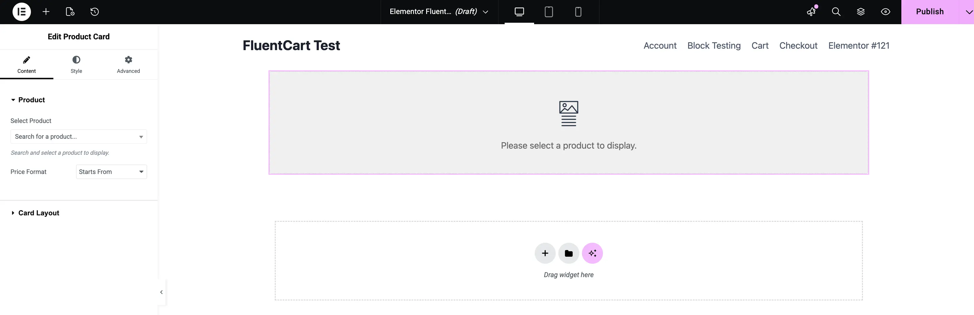
5. Product Card
Renders a single product as a card — the same card layout used in the Products grid, but for a product you pick yourself. Great for highlighting a featured product anywhere on the page.
- Content Tab: Pick the product and shape the card.
- Select Product: Choose the product this card represents.
- Price Format: Pick how the price reads (for example, Starts From for variable products).
- Card Layout: Choose which elements appear on the card (image, title, price, button, etc.).
- Style Tab: Customize typography, colors, spacing, and the card's background and border.
- Advanced Tab: Standard Elementor controls.
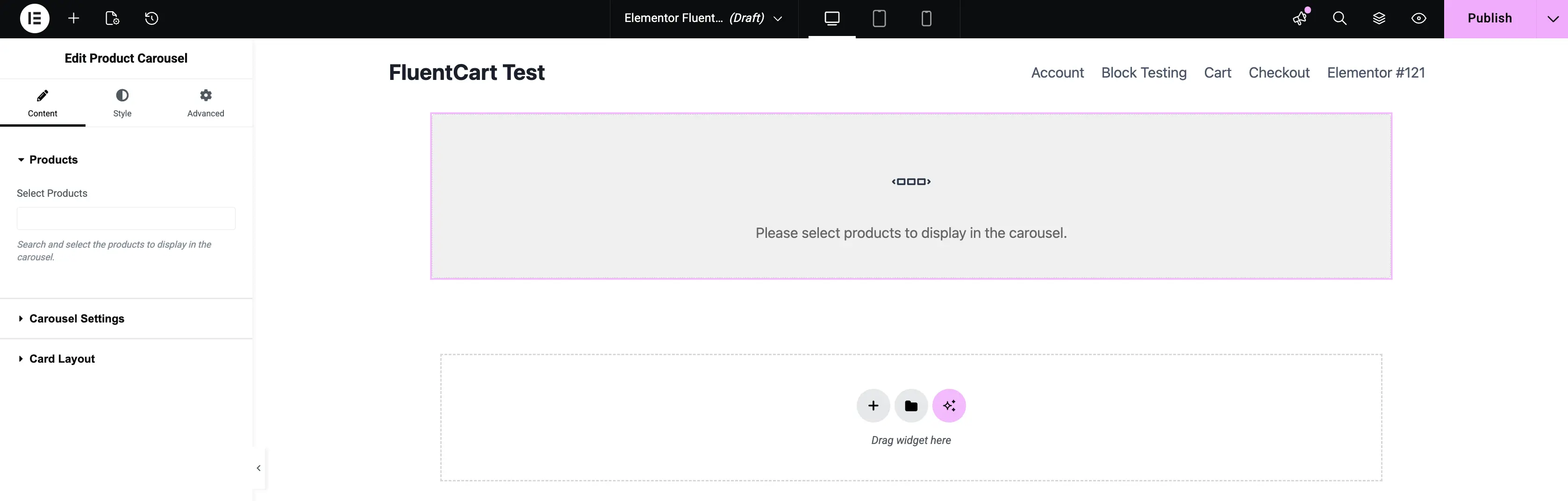
6. Product Carousel
Use this on home pages or landing pages to show off a sliding row of products — perfect for "Best Sellers," "New Arrivals," or seasonal lineups.
- Content Tab: Configure which products show and how the slider behaves.
- Select Products: Pick the products you want in the carousel.
- Carousel Settings: Set how many slides show at once, turn on Autoplay, set the slide speed, enable Infinite Loop, and toggle navigation arrows or pagination dots.
- Card Layout: Customize the look of each product card inside the carousel.
- Style Tab: Change the size and color of the arrows and pagination dots to match your theme.
- Advanced Tab: Add entrance animations or hide the carousel on specific devices.
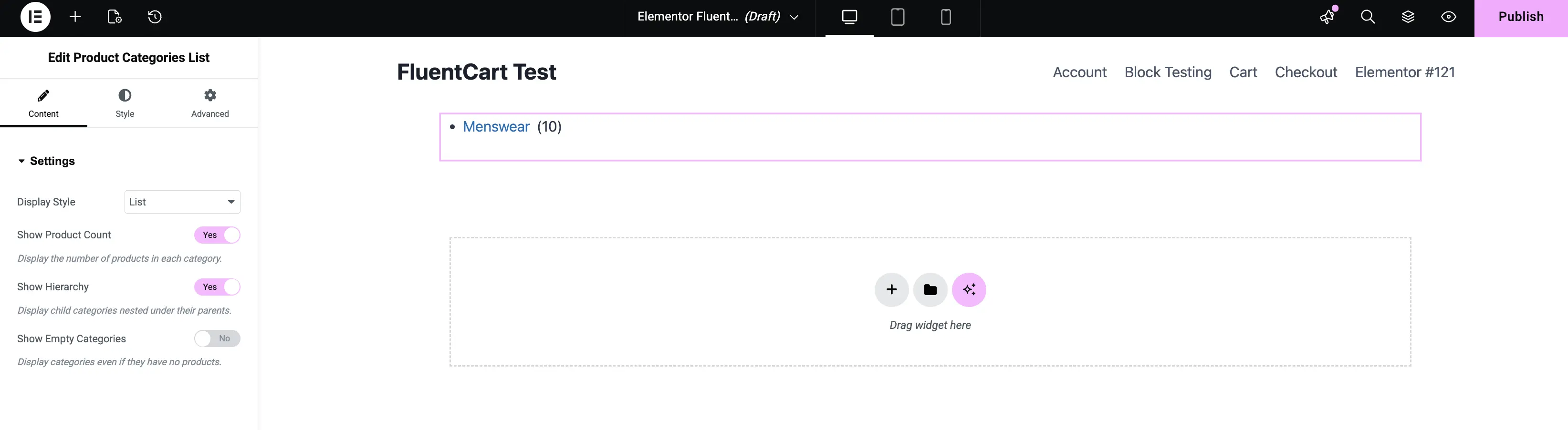
7. Product Categories List
Helps customers navigate your store by listing all of your product categories. Use it in sidebars, mega menus, or category landing pages.
- Content Tab: Set up the display.
- Display Style: Choose between a vertical List or a space-saving Dropdown.
- Show Product Count: Turn this on to display the number of products in each category.
- Show Hierarchy: Turn this on to nest child categories under their parents.
- Show Empty Categories: Turn this on to keep categories visible even when they have no products.
- Style Tab: Adjust spacing, link colors, hover states, and typography.
- Advanced Tab: Standard Elementor positioning controls.
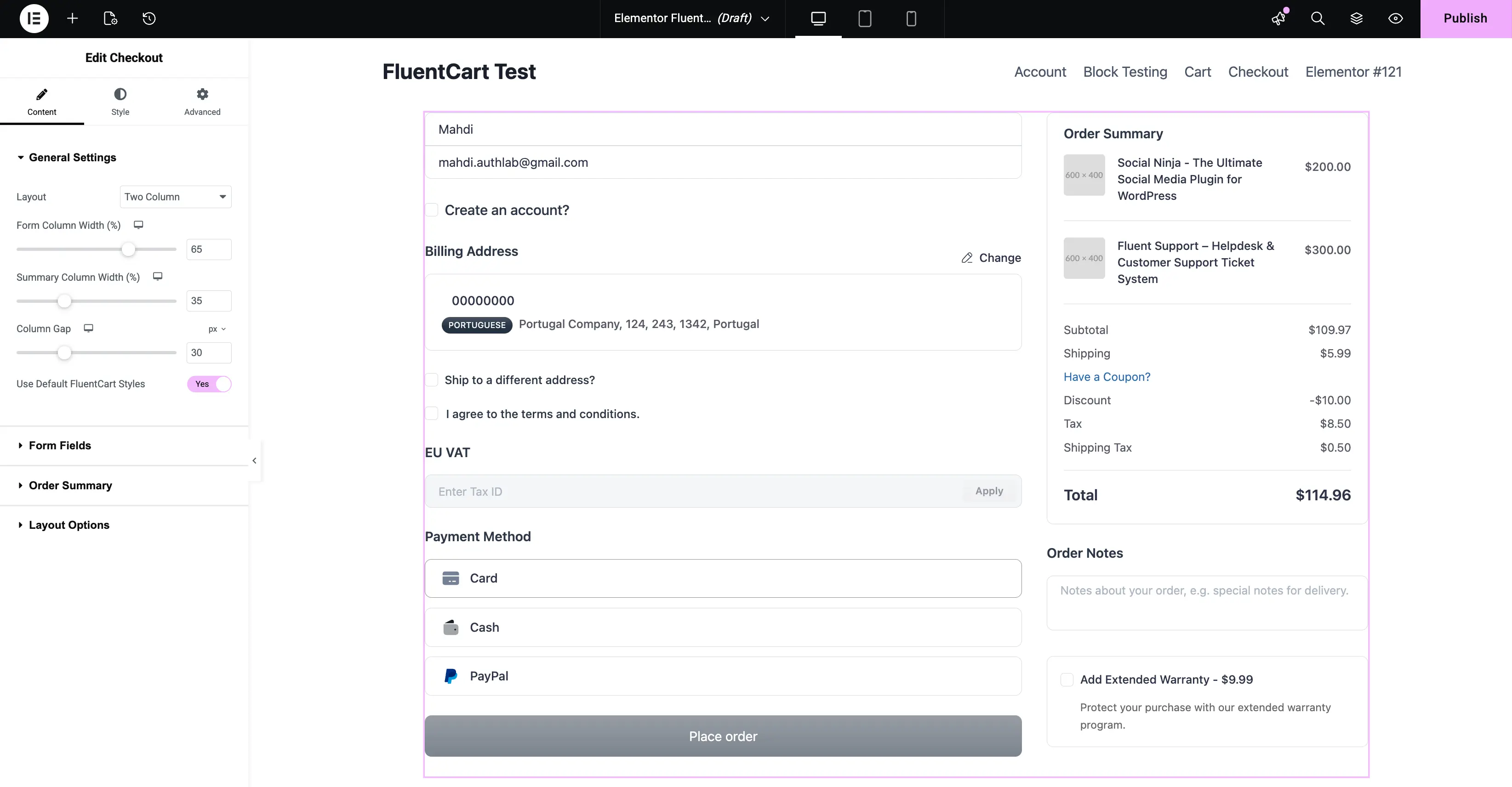
8. Checkout
Place the FluentCart checkout form on any page. This gives you full control over the layout of your sales funnel — useful for one-page checkouts, dedicated landing pages, and custom upsell flows.
- Content Tab: Structure the form.
- General Settings: Pick a One Column or Two Column layout, adjust Form Column Width and Summary Column Width, set the Column Gap, and toggle Use Default FluentCart Styles to apply the built-in look.
- Form Fields: Customize each input section of the checkout — including the EU VAT section, which shows a VAT-ID input for B2B customers in EU countries.
- Order Summary: Configure how the order totals, line items, and applied coupons appear.
- Layout Options: Fine-tune the spacing and structure of the checkout container.
- Style Tab: Available when Use Default FluentCart Styles is set to No. Customize field colors, label typography, button styles, and the order summary box.
- Advanced Tab: Adjust width, spacing, and responsive behavior.
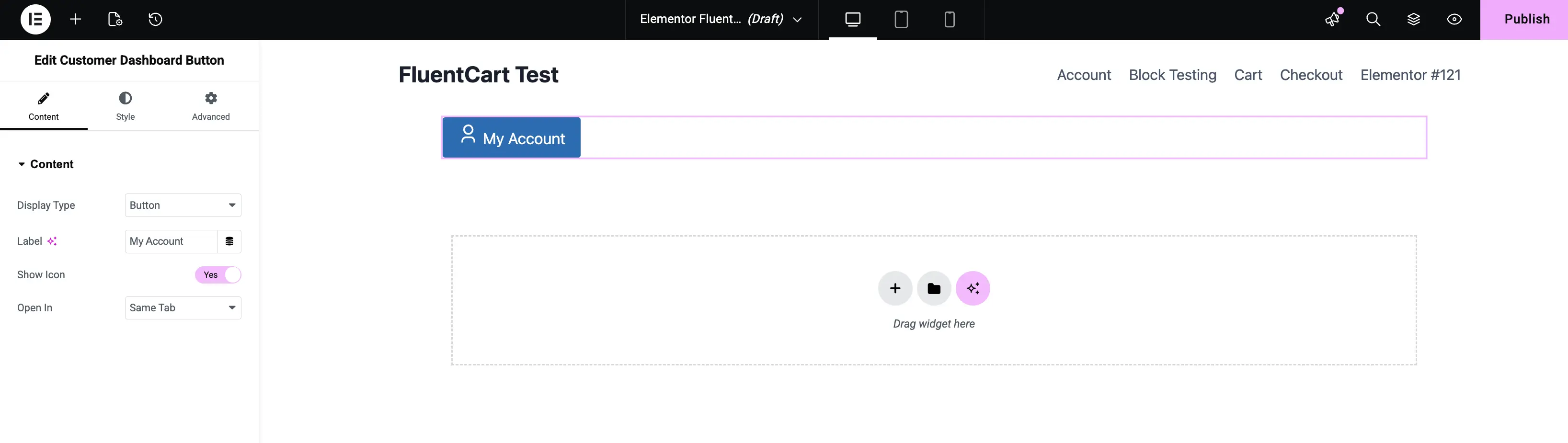
9. Customer Dashboard Button
A button that links to your customer's account dashboard. Drop it into your header, account area, or post-purchase pages so signed-in customers can jump to their orders in one click.
- Content Tab: Configure the button.
- Display Type: Render as a Button or a plain Link.
- Label: Set the visible text (for example, My Account).
- Show Icon: Turn this on to display an icon next to the label.
- Open In: Choose Same Tab or New Tab for the dashboard link target.
- Style Tab: Customize colors, typography, borders, and hover states.
- Advanced Tab: Standard Elementor positioning and responsive controls.
The dashboard page itself is configured under FluentCart Pro → Settings → Pages Setup.
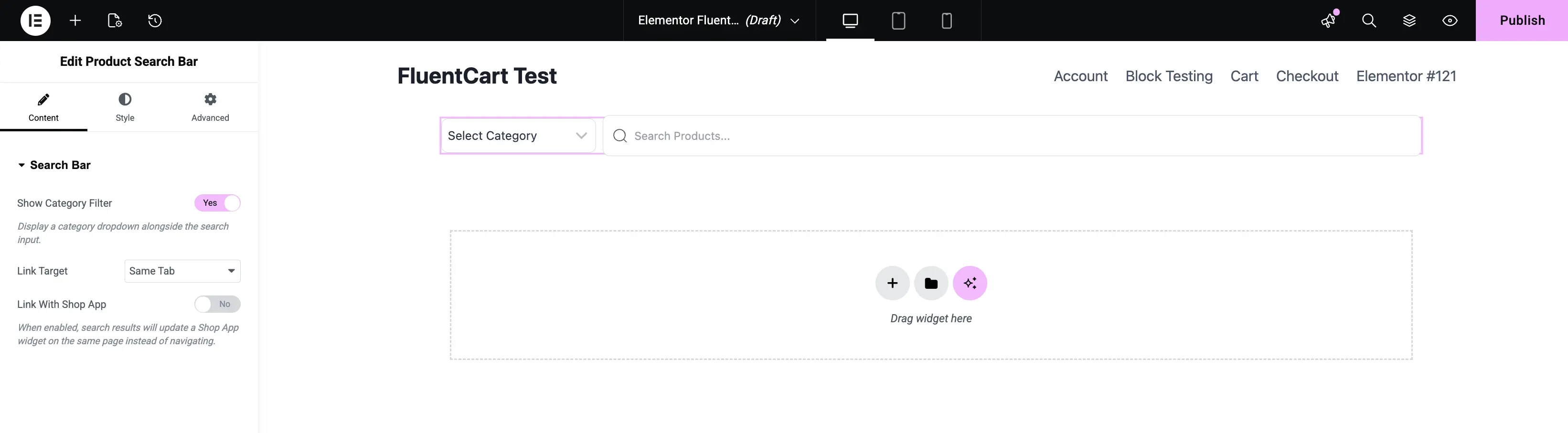
10. Product Search Bar
A search input that lets customers find products from anywhere on your site. Use it in headers, hero sections, or a dedicated search page.
- Content Tab: Set up the search behavior.
- Show Category Filter: Turn this on to add an inline category dropdown next to the search input.
- Link Target: Choose whether results open in the Same Tab or a New Tab.
- Link With Shop App: Connect the bar to your configured Shop App page so results display in your store's layout.
- Style Tab: Style the input field, the category dropdown, the submit button, and the placeholder text.
- Advanced Tab: Standard Elementor controls.
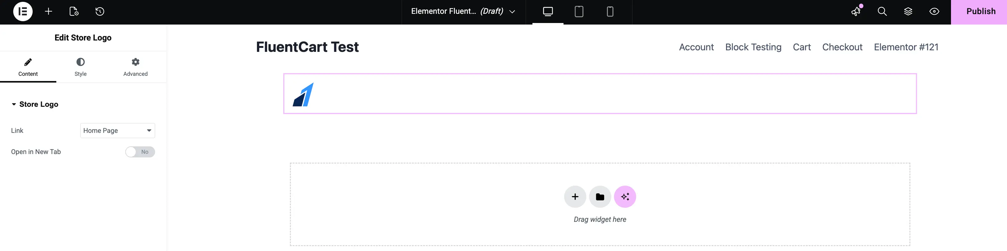
11. Store Logo
Renders the store logo you configured in your FluentCart store settings. Drop it into headers, footers, or invoice templates so the logo updates everywhere when you change it.
- Content Tab: Configure the link.
- Link: Choose where clicking the logo takes the visitor (Home Page or a custom URL).
- Open in New Tab: Toggle on to open the link in a new browser tab.
- Style Tab: Adjust the logo size, max width, alignment, and border radius.
- Advanced Tab: Standard Elementor positioning controls.
To set or change the logo image itself, open your FluentCart store settings.
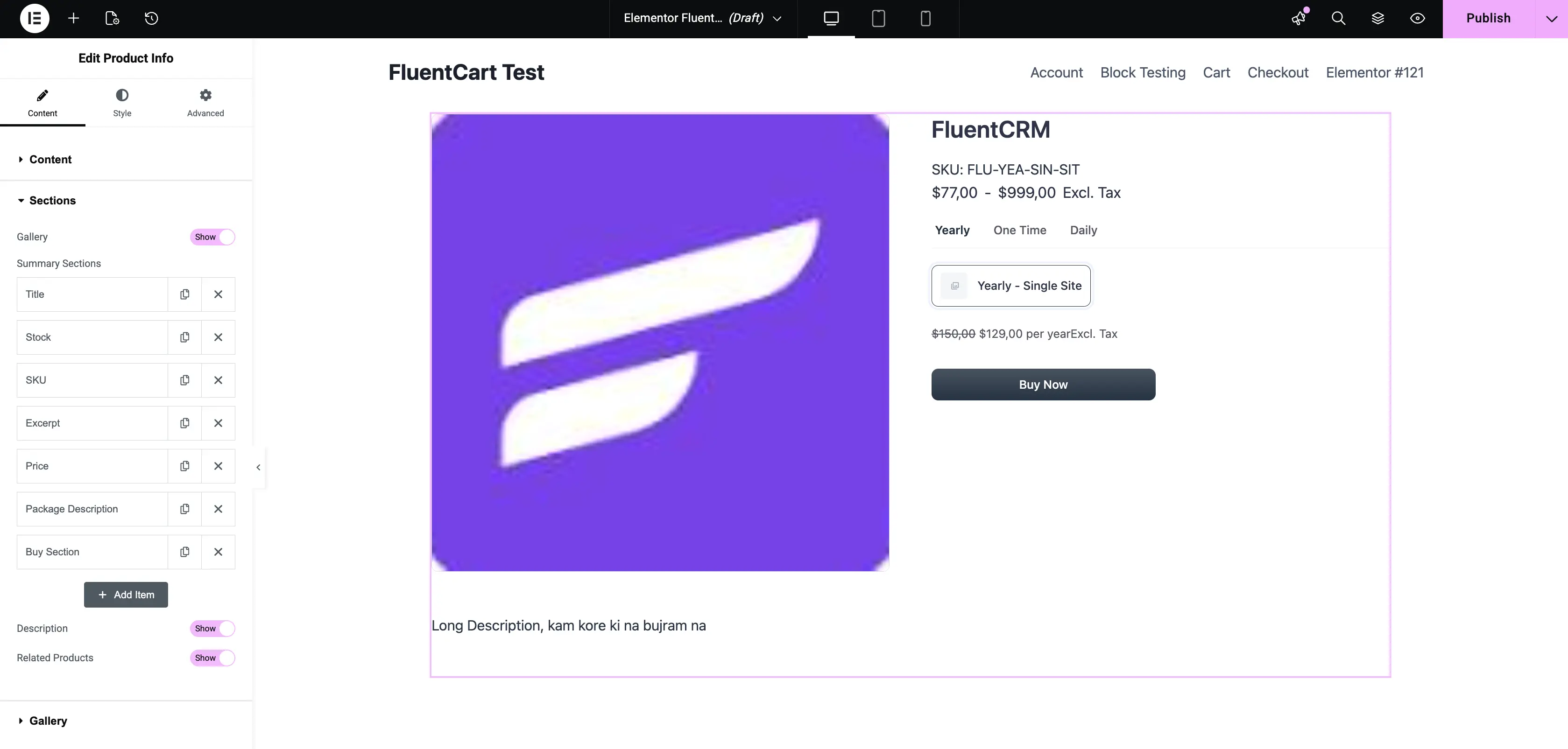
12. Product Info
An all-in-one product summary widget. Instead of stacking a dozen smaller widgets, Product Info lets you compose the entire product summary block — title, price, stock, SKU, excerpt, package details, and buy section — inside a single widget with drag-and-drop reordering.
Content Tab — Display
- Source: Pull data from the Current Product (the product whose template you are editing) or a Custom product.
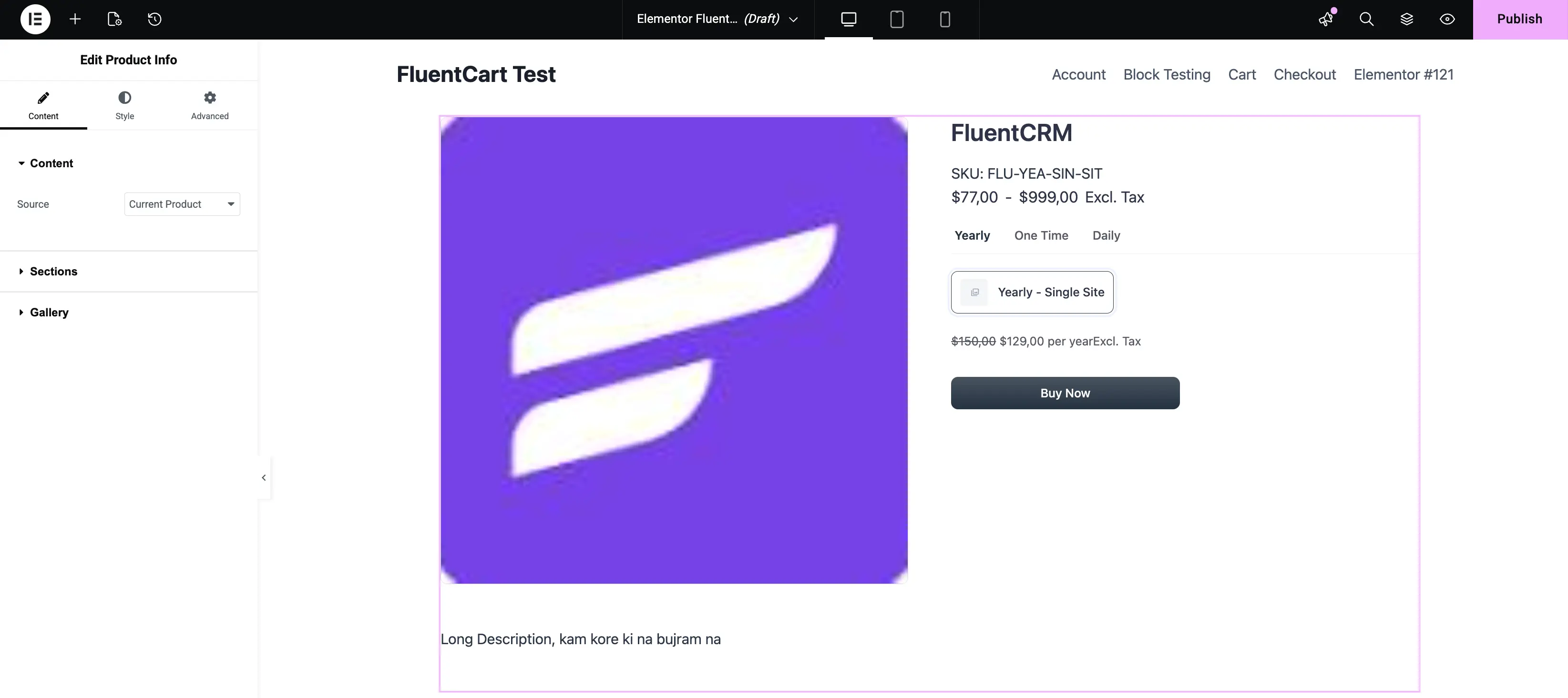
Content Tab — Sections
Product Info groups its output into four section panels you can show or reorder independently:
Gallery: Toggle Show to display the product gallery above the summary block.
Summary Sections: A drag-and-drop repeater that controls the middle block. Reorder, show, or hide any of these rows:
- Title
- Stock
- SKU
- Excerpt
- Price
- Package Description
- Buy Section
Drag the handle on each row to change its position. Click Add Item to insert a new row. The order in the editor matches the order on the rendered template.
Description: Toggle Show to display the product's long-form description below the summary block.
Related Products: Toggle Show to display a related-products row at the bottom.
Style Tab
Each section has its own style panel — Title, Price, SKU, Excerpt, Description, Buy Section, and Gallery — so you can fine-tune typography, color, and spacing per row without touching the others.
Advanced Tab
Standard Elementor controls for margin, padding, and responsive visibility.
What's Next
Looking for the single-product Theme Builder widgets? Head to FluentCart Product Widgets for Elementor for the 10 widgets that power your single-product templates.