Appearance
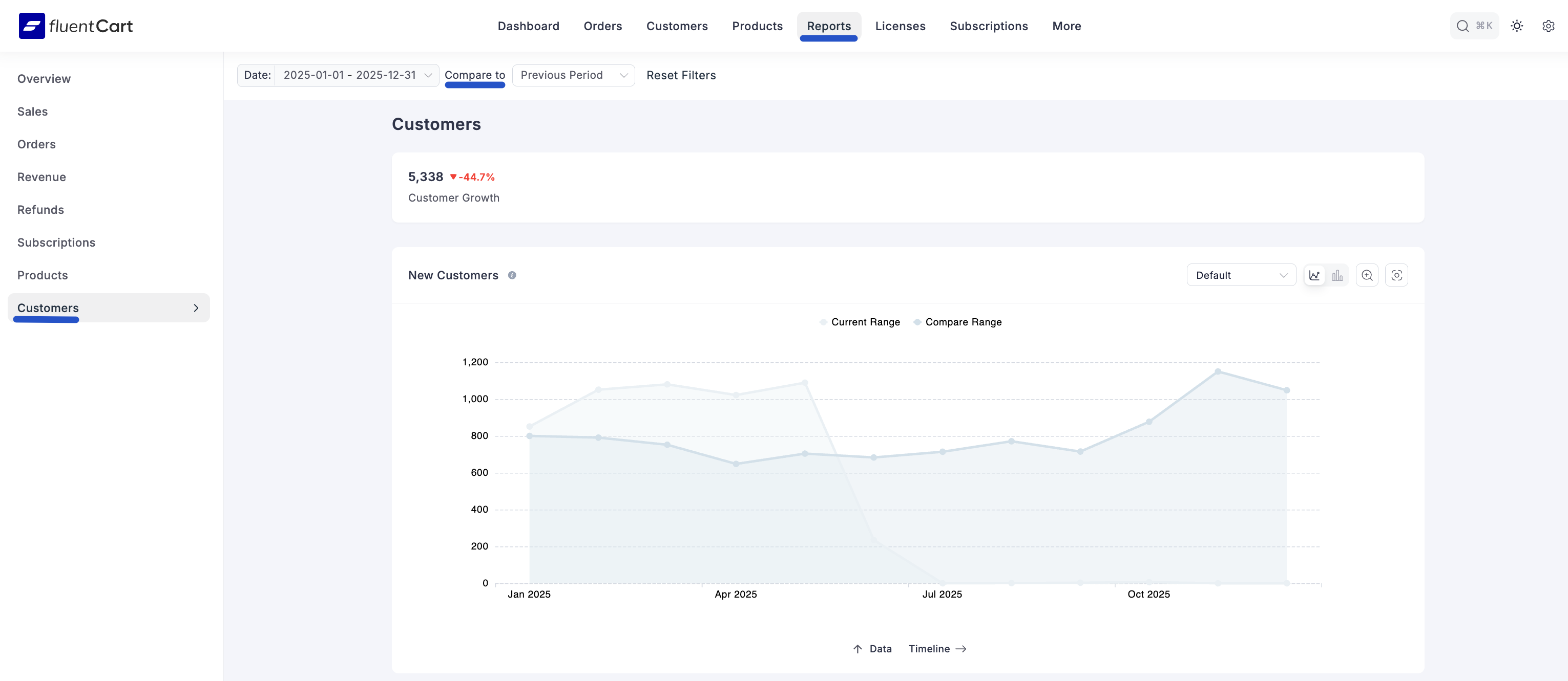
Customer Report Dashboard
The Customer Report tab is your dedicated tool for measuring the success of your customer acquisition and growth efforts. It provides a clear, comparative view of how your customer base is expanding over time, allowing you to assess the long-term health and loyalty of your business.
Accessing the Customer Report
Go to your WordPress dashboard, then go to FluentCart Pro > Reports in the top menu bar, and click on the Customer tab.
Report Filters and Controls
The top of the dashboard provides crucial controls that determine the data displayed in the chart and table.
- Date Range Selector: This field allows you to define the Current Range for your report. You can select a custom start and end date to focus on specific periods, such as a major sale or a specific fiscal quarter.
- Compare To: This dropdown determines the historical period used for comparison. Options allow you to benchmark your Current Range data against prevous time periods.
- Reset Filters: Click this button to instantly clear all applied date and comparison selections and revert the report to its default view.
Key Customer Growth Metrics
At the top of the Customer Report, you will find a summary card highlighting your key customer growth metric for the selected period:
- Customer Growth: This figure displays the net number of new customers acquired during the specified date range. The percentage indicates the growth or decline compared to the previous, equivalent time period you are comparing against.
New Customers
The main visualization on this dashboard is the New Customers. This is a powerful area chart that allows for easy trend analysis and comparison.
- Visual Comparison: The chart overlays two distinct areas—the Current Range (representing the period currently selected in the date filter) and the Compare Range (representing the historical period you are measuring against).
- Trend Analysis: By showing the current period's customer acquisition alongside the past, you can quickly identify seasonal impacts, measure the success of specific marketing campaigns, and see if your acquisition rate is accelerating or slowing down.
Comparison Breakdown
Below the chart, a detailed Comparison table breaks down the growth trend month-by-month, providing the specific data behind the visualization. This section is essential for granular analysis.
- Date: Shows the specific month and year being compared (e.g., "January 2025 vs January 2024").
- Current Range: The total number of new customers acquired during the current month.
- Compare Range: The total number of new customers acquired during the equivalent comparison month.
- Change [%]: The exact percentage of change (growth or decline) between the two months, allowing you to pinpoint exactly when and how much your customer acquisition shifted.

By using the Customer Report, you can move beyond simple sales numbers to understand the most valuable asset of your store: your customer base.