Appearance
Product Report
The Product Report provides detailed analytics on the performance of your individual products. This dashboard is essential for understanding which products are your bestsellers, tracking sales volume, and comparing performance over different time periods to identify trends.
Accessing the Product Report
Go to your WordPress dashboard, then go to FluentCart > Reports in the side menu, and click on the Product tab.
Report Filters and Controls
The top of the dashboard gives you key controls to choose what data appears in the report.
- Date Filter: This field allows you to define the date range for your report, enabling you to focus on specific periods.
- Compare To: This dropdown allows you to choose a past time period to compare with your current data.
- Advanced Filters: Click the filter icon to break down the report by options like Order Type or specific Products. This helps you focus on detailed product data for a closer view.
- Reset Filters: Click the Reset Filter button to quickly remove all selections and return the report to its original view.
Key Product Metrics
At the top of the Product Report, you will find summary cards highlighting your key product metrics for the selected period.
- Units Sold: The total quantity of all product units sold.
- Gross Sale: The total amount of money made from product sales before deductions.
- Refunds: The total monetary value of refunds for these products.
- Revenue: The final income from products after refunds are subtracted.
Each metric also includes a percentage that indicates the increase or decrease compared to the period you are comparing against.
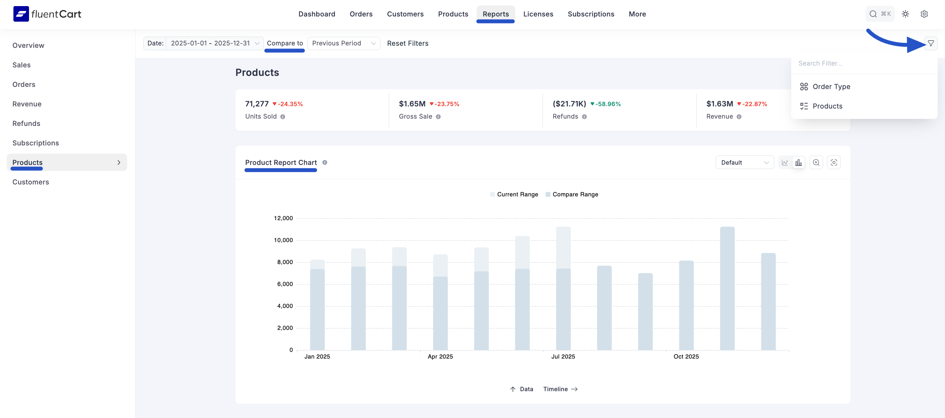
Product Report Chart
This chart gives you a picture of your overall product performance, visually comparing sales between two different time periods.
- Current Range: Represented by the blue area, this shows performance for the period you selected.
- Compare Range: Represented by the green area, this shows performance for the historical period you are comparing against.
Product Performance Comparison
Below the main chart, a detailed comparison table allows you to analyze the performance of individual products between two specific months. Then, the table will then show:
Product: This column lists your individual products.
Sales: This unique column uses a bar chart to visually compare the sales numbers for each of the two months you selected, making it easy to see which products are trending up or down.
Change: This column shows the exact percentage of change between the two months, color-coded for a quick view of performance.
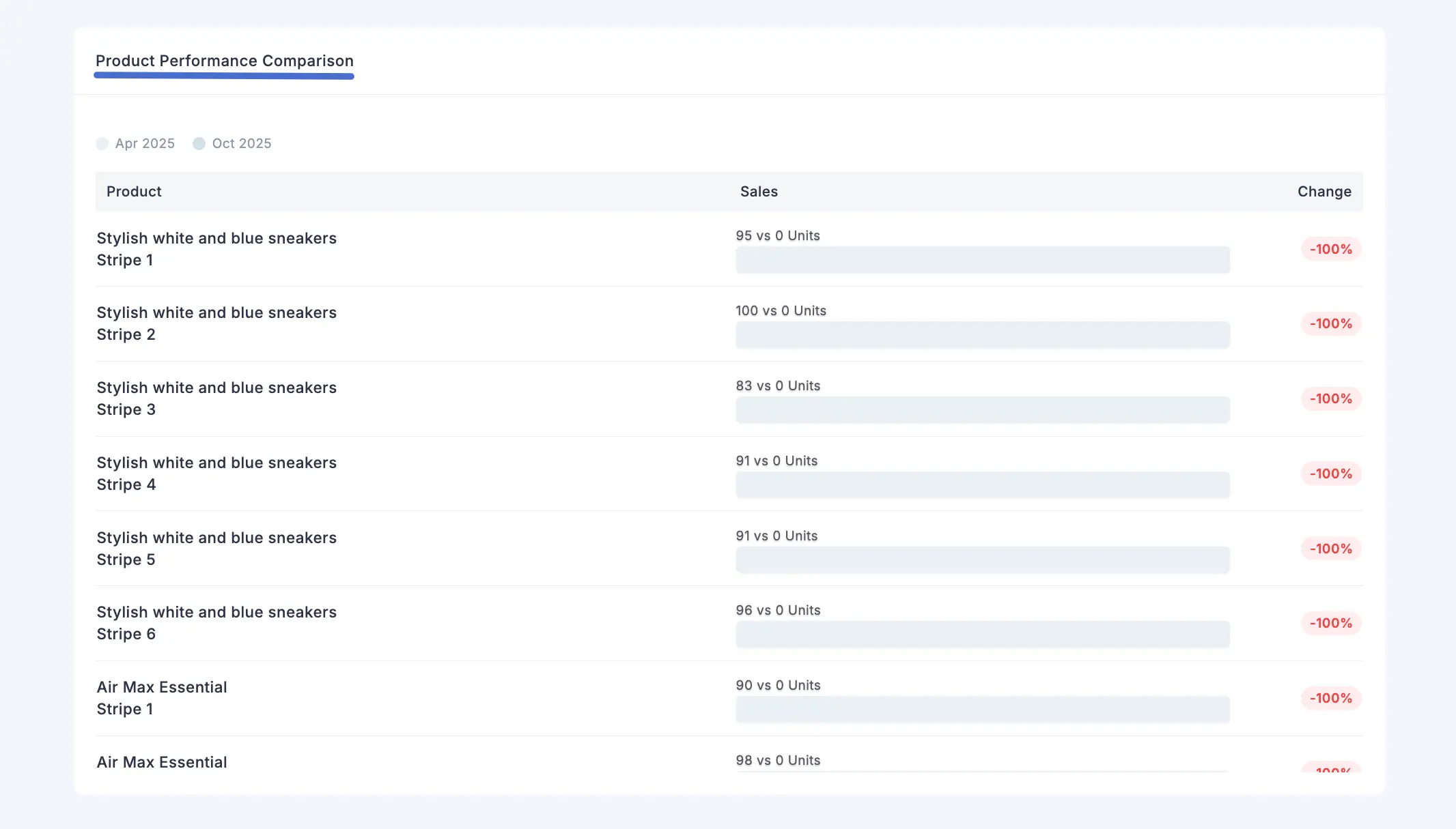
With the Product Report, you can see clear patterns in product demand, giving you the insights you need to make smarter decisions about your inventory and marketing.