Appearance
Orders Report
The Orders Report in FluentCart provides a deep dive into your store's order performance with in-depth analytics. This powerful dashboard allows you to analyze various aspects of your sales data through detailed charts and tables, helping you understand trends, customer behavior, and fulfillment efficiency.
Accessing the Orders Report
Go to your WordPress dashboard, then go to FluentCart > Reports in the side menu, and click on the Orders tab.
Filtering Your Report Data
Want to look at a specific time frame? Or maybe you want to see how this month's orders compare to last month's? FluentCart makes this easy with simple filtering tools.
Report Filters and Controls
The top of the dashboard gives you key controls to choose what data appears in the report.
Date Filter: This field allows you to define the date range for your report, enabling you to focus on specific periods.
Compare To: This dropdown allows you to choose a past time period to compare with your current data.
Advanced Filters: Click the filter icon to break down the report by options like Order Type or specific Products. This helps you focus on detailed order data for a closer view.
Reset Filters: Click the Reset Filter button to quickly remove all selections and return the report to its original view.

Key Order Metrics
At the top of the Orders Report, you will find summary cards highlighting your key order metrics for the selected period.
- Gross Sales: The total revenue from all orders before any deductions.
- Refund: The total amount of money refunded to customers.
- Revenue: The revenue you've earned from orders after refunds are subtracted (also known as net revenue).
- Orders: The total number of orders placed.
- Items: The total quantity of all product units sold.
- Average Gross: The average amount of money a customer spends per order, before refunds.
- Average Revenue: The average value of an order after refunds are considered.
- Average Order Items: The average number of items customers buy in a single order.
Each metric also includes a percentage that indicates the increase or decrease compared to the period you are comparing against.
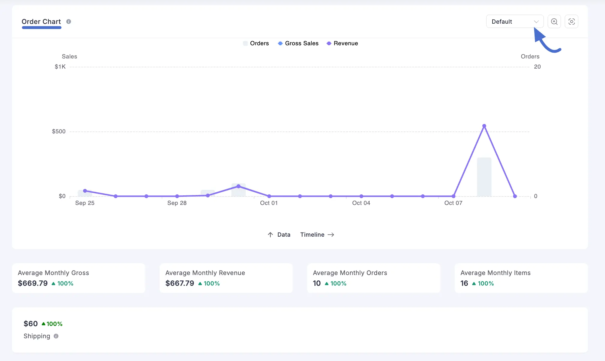
Order Chart
Just below the KPIs, you’ll see the Order Report Chart. This bar chart gives you a clear visual of your store’s performance over time.
You can adjust the chart view to show data by month or year. By default, it’s set to the standard format. To change it, use the dropdown menu located at the top-right corner of the chart section.
Customer Insights
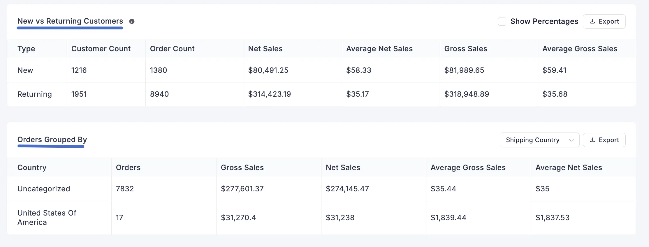
New vs. Returning Customers
This powerful table breaks down your order data based on customer type, helping you measure customer loyalty and the effectiveness of your acquisition strategies.
- Columns: The table displays Customer Count, Order Count, Net Sales, Average Net Sales, Gross Sales, and Average Gross Sales for both New (first-time) and Returning customers.
- Show Percentages: Enable this toggle to view the data as percentages, making it easy to see the proportion of sales from new versus returning customers.
- Export: Click the Export button to download this data as a CSV file for further analysis.
Orders Grouped By
This section provides geographical and temporal breakdowns of your order data.
Shopping Country: This table breaks down your orders and sales data by the customer's country, helping you identify your key international markets.
Orders Grouped By Day and Hour: This heatmap visualizes your store's busiest times, showing which days of the week and which hours of the day generate the most orders.
Additional Order Analytics
At the bottom of the report, you’ll find detailed charts that help you understand customer behavior and order trends.
Gross Sale by Day: A bar chart showing total sales for each day of the week, so you can see which days earn the most.
Gross Sale by Hour: A bar chart that breaks down sales performance for each hour of the day, allowing you to pinpoint your peak sales times.
Item Count Distribution: This chart shows how many orders have 1 item, 2 items, 3 items, etc., helping you understand how many items customers usually buy.
Order Value Distribution: This chart shows how many orders are in different price ranges (like $0–100 or $100–200) so you can see which order amounts happen most often.
Average Order Gross: A line chart that tracks the trend of the average gross value of your orders over the selected time period.
Average Order Items: A line chart that tracks the trend of the average number of items per order over the selected time period.
Time between Order Created & Completed: This chart shows how long it takes to complete an order, helping you see how quickly your team fulfills orders.
