Appearance
Refunds Report
The Refunds Report provides a focused analysis of all refund activity in your store. This dashboard is essential for understanding your refund rate, tracking the total amount of money being returned to customers, and identifying trends that might indicate issues with products or customer satisfaction.
Accessing the Refunds Report
Go to your WordPress dashboard, then go to FluentCart > Reports in the side menu, and click on the Refunds tab.
Report Filters and Controls
The top of the dashboard gives you key controls to choose what data appears in your charts and tables.
Date Filter: This field allows you to define the date range for your report, enabling you to focus on specific periods.
Compare To: This dropdown lets you pick a past period (for example, the previous week, last month, or the same time last year). Your current data is then compared with that past period. This helps you see if your store is doing better, worse, or staying the same over time.
Advanced Filters: Click the filter icon to segment the report by criteria such as Order Type or specific Products, allowing you to isolate refunds associated with certain items.
Reset Filters: Click the Reset Filter button to quickly remove all selections and return the report to its original view.
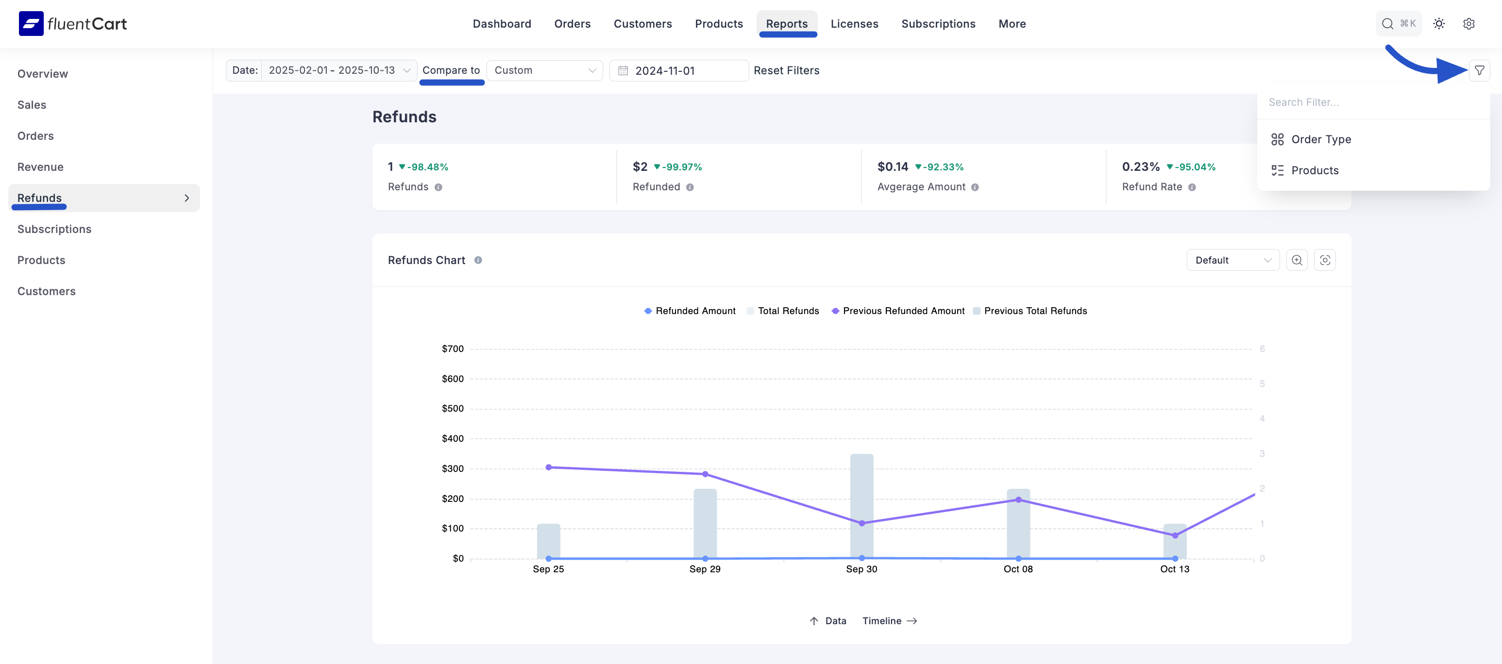
Key Refund Metrics
At the top of the Refunds Report, you will find summary cards highlighting your key refund metrics for the selected period.
- Refunds: This figure displays the total number of individual refund transactions processed.
- Refunded: This shows the total amount of money refunded to customers. For example, if you refunded $200 and $150, the total refunded amount is $350.
- Avgerage Amount: This calculates the average value of a single refund transaction.
- Refund Rate: This key metric shows the percentage of orders that resulted in a refund.
Each metric also shows a percentage, telling you whether the value went up or down compared to the period you selected for comparison.
Refunds Chart
The main chart on this dashboard is the Refund Report Chart. It’s an area chart that helps you easily spot refund trends.
It compares the current period with past periods, so you can quickly see if refunds are going up or down. The chart shows both the Total Refunded Amount and the number of Total Refunds.
Detailed Refund Analysis
Below the main chart, you’ll find more detailed breakdowns that show the data behind the charts. This helps you understand refunds in more detail.
Weeks between an order created date and refund date: This bar chart shows how long it takes for customers to request refunds. It helps you see if problems happen right away or later.
Refunds Grouped By: This table breaks down refunds by things like Billing Country. It shows the number of Refunds, the total Refunded Amount, and the Average Refund, helping you find patterns in specific regions or customer groups.
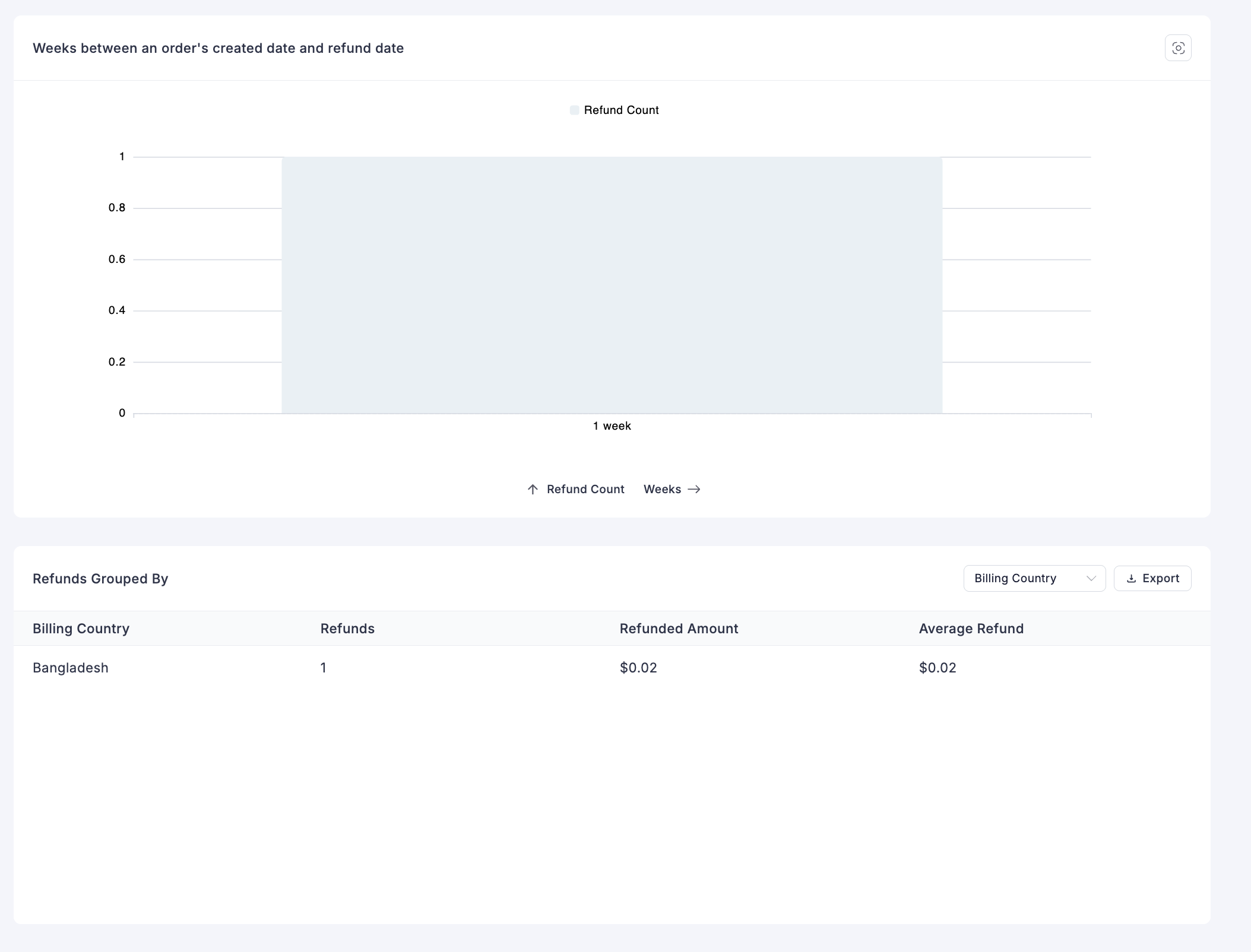
The Refunds Report goes deeper than sales data, showing you the reasons behind customer returns so you can improve your products and services.